In the world of custom design, we are witnessing a significant departure from the stark, “clinical” white aesthetics that dominated the last decade.
Today’s market leaders are shifting toward soft minimalism in packaging, an approach that retains the clean lines of traditional minimalism but replaces its coldness with warmth, texture, and organic path.
For Canadian business owners and marketing VPs, this transition offers a powerful tool for market leadership. It allows a brand to feel premium and high-end without feeling unapproachable or sterile, effectively humanising the unboxing experience through colour and light.
The Shift to Human-Centric Design
Traditional minimalism often focused on removal – taking away elements until only the bare essentials remained, usually resulting in a black and white palette.
Soft minimalism in packaging, however, is about intention. It is classified by a focus on tactile sensations and visual comfort.
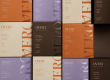
Instead of bright, reflective whites, this trend utilises broken whites like cream, sand, and bone. These shades feel more organic and less manufactured, creating an immediate sense of calm and trust.

By moving beyond the clinical look, brands can create a deeper emotional connection with their audience.
Soft minimalism isn’t about doing less; it’s about doing more with subtle cues. It uses the ‘why’ of your brand – your values and your story – and translates them into a visual language that feels grounded and permanent.
For a decision-maker, this is a strategic investment in brand equity, as it positions your product as a timeless staple in the consumer’s life rather than a fleeting, disposable trend.
Mastering the Palette: Earthy Tones and Gradients
The hallmark of soft minimalism with regards to packaging design lies in its colour theory. Popular colour combinations for this trend often pull directly from the natural world. Think of terracotta and sage, ochre and dust, or muted clay and moss.
These earthy tones provide a sense of stability and reliability that stark white simply cannot match. When these colours are paired with a ‘substrate-first’ approach (where natural texture of the paper or cardboard is allowed to show through) the packaging feels artisanal and high-value.

Gradients play a crucial role here as well. Unlike the loud, neon gradients of the early 2000s, soft minimalist gradients are barely there. They mimic the way light hits a curved surface or the soft transition of a sunset.
These subtle shifts in hue add a sense of three-dimensional depth to your boxes and bags, making them feel more like an ‘object of art’ than a mere operational expense.
Utilizing these gradients is an excellent way to address industry pain points like boring packaging without needing to add expensive foils or complex finishes.
Brands that are Leading the Way
Several global and boutique brands have mastered the soft minimalism aesthetic to great success. Brands like Skims and Glossier were early adopters, moving away from high-gloss finishes toward matte, skin-toned palettes that feel personal and inclusive.
In the food and beverage space, we see brands like Oatly or various direct-to-consumer wellness companies using muted sun-baked colours to signify health and transparency.
These brands understand that the ROI of the unboxing experience is significantly higher when the customer feels a sense of peace upon opening the package.

At LeKAC, we help you achieve this look by focusing on the design-to-delivery roadmap. Achieving the perfect dusty rose or muted terracotta requires a deep understanding of ink absorption and material interaction – things that our trusted suppliers are well versed in.
Nuanced colours require more thought and placement, which is where our team comes in to help. Our graphic designers do all the heavy lifting so you don’t even have to think.
How to Implement the Look
Adopting soft minimalism in packaging is a savvy move for supply chain optimization. Since this style relies on a ‘less is more’ philosophy, it often works beautifully with mono-material designs, which simplify your recycling story and lower environmental impact.
To achieve this look, focus on matte laminations, uncoated papers, and debased logos rather than loud print.
This right-sizing of your visual elements ensures that your costs remain manageable while your perceived value skyrockets – a win-win situation!
When you move toward these warmer tones, you are moving away from the dated look of clinical minimalism. You are choosing a path of industry leadership that values the human experience as much as the product itself.
Is your brand read to move toward a warmer, more intentional look? Book a free consultation with us today to begin exploring the packaging world.