A powerful shift is occurring in the world of custom design. We are moving away from the long, graphic-heavy aesthetics that dominated the last decade.
Today’s market leaders are embracing a quieter form of luxury. They are learning to utilise embossed typography in packaging not just as a tool for communication, but as the main aesthetic itself.
This approach replaces generic product photos with a high-touch experience that builds immediate trust. Is this a masterful way to stand out? Let’s dive in!
Strategic Value of Fonts and Substrates
To understand this design trend, we must first define its core element. Typography is the strategic art of arranging letters and text.
For many brands, typography is merely a font choice. It is simply the way they write their logo, product names, and descriptions. They choose a clean, clear font that customers can read at a glance, prioritising function over feeling.

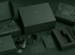
Some brands may add a metallic foil for shine, but the font itself remains a secondary detail. It often sits in the centre of the box, competing for attention against product illustrations or lifestyle imagery.
Hot take, but we think this is where the standard approach is flawed.
Engineering Texture through Lettering
At LeKAC, we help you treat typography not just as information, but as the foundation of your brand’s architecture.
We utilise embossed typography in packaging by taking your key text and scaling it to a point that becomes the graphic itself.
When we scale a word so large that it spans the entire lid of your box, the letterforms stop being readable from a single point of view – they become an organic pattern of curves and lines.

Once the sizing is finalised, we then apply a deep debossing or multi-level embossing. This pulls the paper substrate back, or pulls it forward depending on the option you choose. The typography now has dimension.
It casts shadows based on how your customer holds the box. It even moves the conversation from ‘operational expense’ to ‘object of art’.
When a single word becomes a three-dimensional landscape of light and shadow, the customer doesn’t ask ‘what is this?’ because they feel the quality. They intuitively associate the structural rigidity with the luxury of the product inside.
Simplified Design + Optimised Production
Incorporating embossed typography in packaging into your design phase simplifies your logistics in the long run.
By using texture rather than printing multiple colours and coatings, you create a substrate-first strategy.
This approach often uses fewer inks, aligning with your circular economy goals. It reduces the chance of misregistration in the printing process, lowering your production risk.

By accounting for the internal logic of the die early on in the production process, we’re able to de-risk your supply chain against last-minute adjustments!
The LeKAC Pack’s Approach to Quiet Luxury
The successful implementation of this style is a hallmark of industry leadership.
At LeKAC, our team guides you through this transition seamlessly. Our team manages the structural engineering required to ensure that your large-scale embossed fonts fit perfectly within your mono-material or multi-material suite.
We help you use less in order to communicate more.
We transform your packaging into a strategic growth tool that ensures your first impression is always a lasting one.
Is your brand ready to use texture to speak a more powerful language? Shoot us a message to see what we can do for you today!