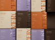
Colour drenching is officially transforming the world of custom packaging.
Technique originated in interior design – where walls, ceilings, and trim are painted the same hue to create an immersive atmosphere. Over time, it has moved into the retail space as a powerful branding strategy.
Colour drenching offers a unique way to turn a simple unboxing into a cohesive, high-end experience that customers remember.
What is Colour Drenching?
At its core, colour drenching is the practice of using a single dominant colour across every element of a project. This may sound one-dimensional, but stick with us here.
In the context of custom packaging, this means the exterior box, interior tissue paper, protective inserts, and even custom labels are all unified in the same hue or closely related tonal shades.
By removing visual boundaries, you create a seamless flow. Instead of a package that feels like a collection of parts, you provide an immersive, curated experience that feels intentional, artistic, and luxurious.

Why Drenching Boosts Brand Perception
Moving beyond standard design choices, this technique acts as a powerful strategic tool to refine how your customers interact with your brand. Here is how the monochromatic approach works to strengthen your professional identity:
- Elevated Perceived Value – monochromatic design is frequently associated with high-end luxury brands. When your packaging is drenched in a specific colour, it feels like a bespoke, limited-edition product rather than an off-the-shelf item.
- Instant Brand Recognition – consistency is the backbone of brand identity. When every physical touchpoint matches your signature brand colour, you reinforce your visual identity in the customer’s mind. Think of the world’s most iconic brands – they don’t just use a logo; they own a colour.
- A Memorable Unboxing Moment – int he age of social media, the unboxing experience is still your biggest marketing asset. A colour-drenched package stands out in photos and videos. It creates a satisfying visual harmony that encourages customers to share your product with their own followers.

How to Implement, Not Overdo
While the trend is definitely bold, it requires a strategic approach. You don’t want the visual experience to fall flat. Here is how to execute this look effectively:
- Vary Your Finishes – since everything is the same colour, you need texture to provide depth. Use a matte finish for your exterior box, a glossy or foil stamp for your logo, and a soft-touch texture for your inserts. The way light reflects off these different surfaces will keep the design from looking dull.
- Focus on Tone-on-Tone – if an exact colour match across different materials (like paper versus ribbon) is difficult, use subtle variations of the same hue. A slightly lighter shade of your brand colour for the tissue paper and a darker, richer version for the box creates depth and sophistication.
- Keep Branding Clean – when the entire packaging is one colour, your logo and typography become the focal point. Use bold, high-contrast layouts so your messaging doesn’t get lost in the drenched effect.

Designing for Your Business Goals
Colour drenching isn’t just about aesthetics; it’s an operational decision to prioritise brand consistency.
Whether you are launching a new product line or looking to refresh your packaging for the coming season, unifying your packaging suite can solve the problem of visual clutter.
At LeKAC, we specialise in helping businesses translate their brand vision into physical reality. Whether you need help sourcing matching tissue and ribbons, or you’re ready to engineer a custom packaging suite that perfectly aligns with your brand colours, our team is here to guide you from concept to delivery.
Ready to make a bold statement? Let’s talk about your next packaging project and how we can bring a cohesive, colour-drenched look to your brand.