When creating a website, looks are only half the battle. For the visually impaired, the wrong fonts and colours can cause major issues for accessibility. So, what should you consider when trying to make your website accessible for the visually impaired?
Read on to learn more!
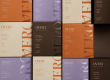
Colour
The first thing to consider when creating your website are the colours that you’re using. Some colour combinations provide clearer contrast, while others become harder to read.
How can you determine what colours work best together? Sometimes the eye can be deceiving; what’s clear to someone with regular vision may not be as clear to someone with a visual impairment.
Websites like Color Safe and Tanaguru take fonts and their background colours, and show you the best possible colour combinations for background and text that meet Web Content Accessibility Guidelines (WCAG).
The higher the contrast between colours, the more accessible the text becomes. Free apps similar to Color Safe such as Contrast and Stark perform similar functions.
Contrast ratios can begin at 1:1, where the colours are the same, up to 21:1, the highest level of contrast. The WCAG specifies that the minimum standard ratio is 4.5:1 for small text, and 3.1:1 for larger text.

Font
So you’ve chosen a good combination of colours, what’s next?
The font that you use for your website can also make your website more accessible for the visually impaired.
Serif and sans-serif are the two main font categories. Serifs are the small strokes placed at the longer strokes of letters, whereas sans-serif fonts exclude these strokes.
Most accessible web fonts are soft, round, sans-serifs, as script and serifs can get harder to read. Some of the most common accessible fonts are Arial, Century Gothic, Helvetica, Tahoma, and Verdana.
Fun Fact: Did you know that Dyslexie is a font made for people with dyslexia?

tools for making your website accessible for the visually impaired
Though the visual aspect of your website is important, other tools can also open doors for accessibility. The website plugin Recite Me allows users to customize a webpage to their specific needs across multiple platforms.
This includes text-to-speech (TTS), and changing the style of the text. Some TTS services like Recite Me can be added directly to your website for all visitors, while others need to be added by the user to their own browser. If you have images on your website, adding alt text is also a great way to help TTS readers describe them.

Accessibility in your packaging
In summary, if you want to make your website more accessible, consider choosing high contrasting colours, easy to read sans-serif fonts and adding website plug-ins such as Recite Me! It may not seem like a lot, but by being more inclusive you can better respond to the needs of your customers!
So how does this relate to packaging? Accessbility isn’t limited to just the web, it can be applied to packaging too!
Accessible packaging refers to a way of packing items that makes them easy to open and access. Having accessible packaging leads to an ultimate improvement in every user’s experience.
At LeKAC, we strive for great service , which includes accessibility. That’s why our team works at providing suggestions that we know lead to a better unboxing experience for all individuals.
Interested in finding out more? Contact us today! In the meantime, be sure to check out our blog post on accessible packaging for the visually impaired!