
Organization in writing is essential to making sure you get your meaning across. By using typographic hierarchy, you can make sure that your reader can see and understand what you’re writing down. But what is typographic hierarchy? How can you use it in your packaging?
Keep reading to learn more!
Defining typographic hierarchy
Typographic hierarchy is a system where different fonts, sizes, and colours mark importance. These distinctions tell readers where to look for information and what’s important.
For example, in this blog post you’re reading right now, you can already see three different distinctions!
The title is the biggest and is at the top of the page. There’s also paragraph text, which is what you’re reading right now, and a smaller heading that breaks up the blog post into a separate section.

Each of these types of text make the blog post easy to read and flow easily to the eye. Creating these distinctions is easy on the web. We can change header sizes at the click of a button, and the built in tools do the rest! But how can you apply this to your packaging?
examples in packaging
Although creating typographic hierarchy might seem like a challenge, it can be much more simple than you think!

For example, in the LaCroix bag above, the name of the company is the largest, showing that it’s the most important. The second level of text surrounds the brand name, telling you exactly what the company sells.

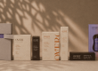
The chip bags above use a lot of text, but use different font sizes to mark importance. The text is the main part of the design, and immediately signals what’s important in chips–the flavour!
when should i use this?
While hierarchies are usually top-down structures, typographic hierarchy isn’t restricted to linear organization! While the text on some packaging is sometimes a secondary thought, it can also be the basis of the design!

For example, this So Good… Naturally packaging uses a mixture of fonts and colours to mark importance without reading it from top-down. The use of contrast in this packaging helps the hierarchy by drawing your eye!
Thinking about typographic hierarchy when designing packaging is especially important in text-heavy packaging. However, it should be considered in all packaging! Even illustration-heavy packaging needs some text to help it along.
How can LeKAC help?
If you’re not sure how to organize your text, our design specialists have your back! We can help make suggestions on your existing design, or create you something completely unique!
Custom packaging doesn’t have to be confusing! Contact us today to learn how LeKAC can help bring your packaging ideas to life!


Love that LeKAC makes custom packaging easy! Great to know there’s expert help available for both refining designs and creating something unique.