Trends are constantly changing, and we are always staying up to date with different packaging concepts and designs. In 2019, we wrote a blog post about trends and for the most part, they’ve already changed drastically.
In case you missed it – click here.
If you need a quick recap, here were the trends for 2019:
- gradients
- retro designs
- 3D type
- art deco
- vibrant colours
- responsive logos
You’re probably thinking “alright, but that was last year, what are the top trends predicted for 2020?” We’ve got 8, so read on to find out all the details!
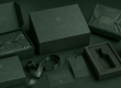
Neutral Colour Schemes
Literally in contrast to 2019’s vibrant colours, 2020 packaging should shift towards neutrals. The psychology of colour is important for many aspects of business, especially packaging since it is normally the first physical contact with the consumer.
Colour choice impacts purchasing decisions, and consumers will subconsciously be attracted to specific packaging based on colour. For example, the colour red is fierce and suggests passion, excitement and warmth. Designs are shifting towards more neutral tones in order to move away from the bold in-your-face colours that are flooding the market.

Tonality and Combinations of colours are equally important as they define your consumer’s mood. Choosing a light, pale blue that is similar to grey is more peaceful and neutral compared to its colder, darker counterpart. Neutral colour schemes give a smooth and soft feeling to the product packaging and pair well with shiny items, such as gloss tins and metallic products.
Repetition
Art repetition is seen as one of the fundamentals of creativity and helps to create movement in an art piece. This extends to packaging as well with different elements being repeated. Such elements are colour, design, lines, bold fonts, and so on – basically, anything that a consumer will recognise.
Although repetition adds dimension to the packaging, its main purpose goes much deeper than that. This trend helps to provide consistency to a brand, and is a conscious effort to unify parts of a design.
The more repetition, the better as it helps to show a strong brand message to your target consumers and encourages recall.

Manipulation
The manipulation of art in packaging is slightly similar to our previous trend, but is more concerned with abstract concepts. They are alike in the sense that they both lend a hand to brand recognition, but that’s where their similarities end.
Instead of using stock photos or plain logos, manipulation of art helps packaging become more creative and dreamy in an effort to stand out among other typical packaging designs. You are able to produce something special and ultra-unique to your brand and company, giving your consumers a little part of you in the process.
As this deals with more abstract ideas than real-life situations, you’re able to convey your brand’s message. For example, if your company is concerned with water-contamination and wildlife, you may consider creating a realistic concept meshing animals and bodies of water. Think of a fish, but instead of scales you see water. While you won’t find this in real life, you’re still able to get your message across to your target audience.
Blurred Shapes
Blurred shapes are another popular trend that is gaining traction this year. You can choose how to enhance your design and become very specific with which elements should be blurred, and which should remain clarified. This aids customers in recognising what is important and what is simply supplementary. In this sense, the packaging is functional and beautiful.

This particular trend gives a cool and edgy feel to your packaging products, and it is capable of doing the following:
- striking a particular mood
- allow typography to stand out really well as opposed to other design techniques
- subtly increase brand visibility when paired with the correct typography
Gusset Detailing – Line Art and Geometric Shapes
The gusset has long since been disregarded as extra space on a bag and given no focus. This year, more and more companies are recognising the usefulness of this space, adding elements to effectively communicate ideas and concepts. Through the use of line art and geometric shapes, the customer is presented with unexpected designs which is very visually appealing.
Line art is elegant, simple, minimalistic and clean, and geometric shapes show the neat structure layout for packaging. This combination makes the design both bold and unique, and the attention to detail gives the product a certain authenticity.

Companies of all industries are embracing this trend for their packaging designs, making them stand out amongst competitors!
Transparent Packaging
Who doesn’t love getting a peak at a product before purchasing it? While window packaging has been around for eons, there’s something to be said for full transparency and incorporating those windows into the design of your packaging.
Especially popular in the food industry, transparent packaging is on the rise. The layering of design elements on transparent materials, such as glass, showcases the product and its colouring. In these instances, the product itself acts as the background for the product information.
This is a minimalistic approach that focuses on the product itself without taking away from the product design. It also adds contrast as the information is juxtaposed with the product contents.
Two Continuing Trends – Retro Design and Sustainability
I know at the beginning of this blog post, we said trends are constantly changing. But these two seem to be sticking around – and with good reason!
Retro Design Styles
Using retro styles in packaging evokes anticipation and nostalgia within consumers and helps them identify with an at-home feeling.
Retro designs are identified by the use of muted colour palettes, round shapes, and retro-inspired typography. Retro designs work because they convey authenticity – even if the product and brand are new on the market!
New and improved packaging is constantly being released and creating the most inventive and decorated packaging just isn’t cutting it anymore. Retro designs provide timeless artwork that will never go out of style, which is why this trend is still at the helm of packaging trends. We may have just entered a new decade, but this trend is going to be around for a long time.
Sustainability
I think it’s actually safe to say that sustainability is no longer a trend, but rather a staple in packaging nowadays. Sustainable packaging reduces our ecological footprint and is definitely needed in today’s climate.
Sustainable doesn’t have to mean boring and bare. Although the Kraft paper look gives a natural and authentic feel to packaging, it’s quite common to create eye-catching packaging that is still aiding the environment. There are many alternative materials for packaging, and we offer many:

- Hemp
- Cotton
- Bamboo
- Cardboard
- Paperboard
… and many more!
How Can I Incorporate these Trends?
Easy! Contact LeKAC Sourcing Limited for help designing your new packaging products.
Our company will help you from conception to completion and you will have access to the full knowledge of our product specialists, logistics experts, and graphic designers.
Take a look at our official Instagram page to stay up to date on the latest trends and see what’s on the horizon for packaging!
Not sure which trend is right for you? It all depends on your brand persona. Is your company bold and creative? Relaxed and subdued? Playful and young? Let our guides help you determine which design would attract your target market most. With LeKAC’s help, you’re sure to invent trendy packaging that will make an impact!