Every year, the Pantone Colour Institute chooses a colour to reflect the year ahead. This year, the Colour Institute announced that PANTONE 17-3938 Very Peri is the colour of 2022!
The Pantone Colour of the Year influences multiple industries including packaging, and sets design trends for the coming year. But how did they decide on this year’s iconic colour? What impact will this have on your packaging? Read on to find out!
WHAT IS THE PANTONE COLOUR INSTITUTE?
Firstly, the Pantone Colour Institute is a business unit within Pantone. They forecast global colour trends, analyze colour psychology, and advise brands on colours for product and brand identity. The Colour Institute also offers colour consulting as a part of its services. They strive for colour education and provide resources about colour theory and psychology!

Overall, the Pantone as a company is iconic for its universal colour system. Using a numbered chip format, Pantone helps designers and manufacturers consistently and accurately replicate colour palettes anywhere in the world!
We’ve talked about the different uses of the Pantone Matching System in a previous blog post. Be sure to read that to learn all about Pantone’s uses!
Introducing Very Peri
Usually, Pantone chooses from its wide range of swatches to choose the Pantone Colour of the Year. This year, however, they created an entirely new colour! Very Peri is described as a colour that has all the quality of blue tones, but with a violet-red undertone. This gives the colour its unique vibrance, while also being a very calm colour.

The colour was created to reflect the merging of our digital and physical lives due to the ongoing COVID-19 pandemic. Pantone Colour Institute Vice President Laurie Pressman indicates that the Colour of the Year:
reflects what is taking place in our global culture, expressing what people are looking for that color can hope to answer.
Source
Pantone Colour Institute Executive Director Leatrice Eiseman called Very Peri the “happiest and the warmest of all the blue hues”.
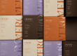
IMPACT ON PACKAGING
Similar to previous years, count on Very Peri to make an appearance in the packaging world! While it’s a cooler colour, it has some warmth to it. This makes Very Peri versatile for plenty of types of businesses.
According to Pantone: “Very Peri helps us to embrace this altered landscape of possibilities, opening us up to a new vision as we rewrite our lives.” Despite its blue-based hue, the colour’s underlying warm tone makes it an inviting option for any product.
Interested in what last year’s Colour of the Year was? Check out our blog post to find out!
Want to incorporate Very Peri into your designs? Contact us today! Our talented graphic designers can make suggestions on how best to use Very Peri for your business! Not sure if this shade is right for you? Check out Pantone’s colour-matching system to choose another Pantone shade!