
With several locations in the Greater Toronto Area (GTA), Hattendo is a famous confectionary brand. Recently it gained a lot of attention across its social media for its creative and illustrative seasonal packaging.
So without a further ado, find out how our design specialists designed Hattendo’s seasonal packaging for the Winter of 2021!
About Hattendo
In 1933, Hattendo opened its first bakery in Minatomachi in Mihara, Hiroshima. Since then, Hattendo has expanded to over 90 locations in Asia. In 2019, the company established its first location in Toronto, Canada.
Hattendo specializes in delectable buns filled with custard and different flavours of cream. The bakery also offers pudding jars, drinks, seasonal flavours and melon buns!
Third-generation owner, Takamasa Morimitsu, has made it Hattendo’s mission to deliver great taste, safe food and happiness to their customers. In fact, he’s responsible for making Hattendo what it is today – a fusion of Japanese and western confectionery arts.


Hattendo’s Seasonal Packaging
Keeping Hattendo’s ideals and values in mind, our design specialists were able to create the following winter box.

From the initial concept to the final product, our team kept in close touch with the company to update them on our progress.
Although we weren’t given any specific directions or colour restrictions, one thing was clear – Hattendo’s seasonal packaging should represent a mix of Japanese and Canadian culture.
In turn, this reflects Hattendo’s personal journey as a Japanese brand which came to Canada and their effort towards blending into the local culture.
Initial concept
For the initial concept, we went through numerous designs and tried paint and illustrative styles.
Our designers performed extensive research as well on various elements that would represent both Canada and Japan.
For Canada, we considered the elements of a maple leaf, the CN tower, autumn colours and moose. On the other hand, we listed Japanese elements such as Mount Fuji, the fish flag, sakura flowers, etc.


As we sifted through various concepts, we finally settled on a concept similar to this. We felt that it was overall much more cohesive, scenic and in line with what Hattendo wanted for its seasonal packaging.

Design modifications
Once we’d established a concept, we modified the initial design so it’d be less animated. We also changed the scene to represent a winter landscape. The design modifications didn’t take too long and within a couple of days, we were able to finalize the following 2D design!

This vector illustration is predominantly made with solid colours. To show shadows on the mountain, our designer effectively used colour blocking and the overall design achieves a great contrast between the warm and cool tones.
While one side of this handle carrier box represents Canada, the opposite side represents Japan. Nevertheless, through the placement of mountains we’re able to show the Canadian Rockies merging with Mount Fiji, further symbolizing the message of unity and fusion of cultures!
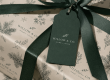
Although the logo design was provided by Hattendo, our designer was able to add thin black strokes to make it stand out. The sakura flowers were also replaced to create the illusion of a cold winter morning.
The result
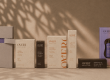
Overall, we were successful in creating the fusion of two cultures as per our client’s needs. Moreover, we also had the opportunity to show these mini 3D paper mockups before Hattendo approved us for the next stage: mass production.

At last, the carrier boxes were produced! And since then, they’ve been receiving a lot of attention and popularity on social media! All in all, Hattendo’s seasonal packaging was crowd favourite. Since, then we’ve had the opportunity to work on their packaging for Spring and Winter 2021 as well!

Would you like to create seasonal packaging for your brand as well? Contact us today for a free consultation! Whether you have your own design or need a helping hand, our design specialists are with you every step of the way!


Hey, check this out! Cool article on custom branded boxes. It’s got some sweet ideas for making your packaging pop. Worth a quick read!