In today’s crowded market, packaging needs to do more than protect your product; it must create a powerful connection. Leveraging the five senses through thoughtful sensory packaging can be a game-changer for your business.
When packaging engages sight, touch, sound, smell, and even taste (indirectly of course!), it transforms a transaction into an unforgettable brand experience. This deep engagement builds loyalty and drives repeat sales.
Let’s go over the main components of a sensory audit and explore how to design custom packaging that captivates consumers on every level.
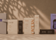
Sight – The First Impression
Sight is, of course, the most dominant sense in purchasing decisions. Your packaging must grab attention quickly on a crowded shelf or in a customer’s feed.
Visual appeal is created by consistent use of brand elements. This includes your logo, colour palette, and typography. For instance, luxury brands like Tiffany and Co famously use their distinct robin’s egg blue. This colour instantly communicates exclusivity and quality, making their jewellery boxes instantly recognisable worldwide.

Furthermore, contrast and clear information hierarchy are vital. Ensure your product’s key benefits are readable within three seconds. High quality printing, sharp imagery, and special finishes like spot UV or metallic foils also elevate the perceived value of the product.
Touch – The Tactile Connection
The moment a customer picks up your product, their sense of touch begins evaluating its quality. The texture and weight of the packaging communicate an unspoken message about what’s inside.
Weight and Sturdiness – a heavy, sturdy box suggests durability and high quality, often used by electronics or high-end spirits brands. Flimsy packaging, by contrast, can suggest a cheap or inferior product.
Surface Texture – consider the finishing. A matte, soft-touch laminated finish conveys elegance and sophistication, popular in the cosmetic industry. On the other hand, natural, uncoated cardboard suggests an organic or sustainable brand ethos, appealing to eco-conscious consumers.
Embossing and Debossing – adding raised (embossed) or indented (debossed) text or patterns creates a premium, tactile element. These textures invite consumers to handle the package longer, deepening their engagement with the brand.
Ultimately, thoughtful tactile design can establish a powerful, subconscious association between the package’s feel and the product’s quality.

Sound – The Unboxing Symphony
Sound? Related to packaging? Stay with me now…
Sound may seem irrelevant to packaging, but the noise a package makes during handling and opening is part of the experience. This is often called the ‘unboxing soundscape’.
The crinkle of custom tissue paper, the satisfying pop of a well-sealed cap, or the smooth tear of a pull-strip all contribute to the overall feeling. Brands like Apple engineer their box lids to slide off with a specific, slow, and weighty ‘hush’ sound.
This sound subtly communicates premium engineering and high value. Consequently, minimising rattling or cheap-sounding materials is essential. Aim for sounds that suggest precision, quality, and a delightful reveal.
Smell – The Aromatic Memory
Smell is the sense most closely linked to memory and emotion. For products like coffee, soap, or perfume, the scent is part of the product itself. However, you can also leverage scent in secondary packaging.
For example, some high-end clothing retailers subtly infuse their internal tissue paper with a signature fragrance. This immediately creates a pleasant and memorable brand association when the box is opened. Even for non-scented goods, ensure your packaging materials themselves are neutral.
Avoid materials that carry unpleasant chemical odours. A fresh, clean, or subtly branded scent can enhance the perceived luxury and freshness of the product inside.
Taste – The Indirect Cue
While packaging generally shouldn’t be consumed, the sense of taste is often triggered indirectly through visual or aromatic cues.
Certain colours and imagery signal expected flavours or freshness. For instance, food packaging uses bright, vibrant colours and high-definition images of the product to make it look delicious. The overall visual quality of the packaging sets an expectation for the product’s taste quality.
If the packaging looks premium and fresh, consumers expect the taste to match that high standard. Brands that use clean, transparent packaging for food items, such as artisanal bakeries, visually suggest the freshness that leads to a great taste experience.

Brands Excelling at Sensory Packaging
Lush Cosmetics (The Retail Experience)
Lush is an excellent example of a brand where the entire product and packaging system is a sensory experience, starting well before the box is even opened.
- Sight – their products are often brightly coloured, handmade, and displayed openly, appealing visually with their artisanal look. Their simple, minimal packaging and clear fonts keep the focus on the vibrant products inside
- Touch – customers are encouraged to pick up, hold, and interact with the textures of the solid bath bombs and soaps. The recycled paper bags or simple wrap they use communicates their commitment to sustainability
- Smell – this is their most dominant sense. The powerful, natural scents from their products fill the store, creating an unmistakable, overwhelming, and memorable brand atmosphere that draws people in from blocks away
- Sound – while subtle, the soundscape of their shops (cheerful chatter, splashing of product demonstrations) contributes to a fun, energetic, and engaging atmosphere
- Taste – Lush’s visual cues (bright colours, fruit and vegetable ingredients on display) and strong, fresh scents evoke a feeling of ‘clean’ and ‘natural’ that hints at the purity of the ingredients
Nespresso (The Premium At-Home Experience)
Nespresso has successfully transformed the simple act of making coffee into a ritual that engages multiple senses, largely due to its premium custom packaging.
- Sight -the packaging for their sleeves of capsules is sleek, minimalist, and uses vibrant colour-coding to signify different blends, creating a visually appealing and organised experience
- Touch – the coffee pods themselves are weighty and smooth aluminium, conveying quality and precision. Their machine packaging is carefully designed for a structured, premium unboxing feel
- Smell – the foil-sealed capsules preserve the fresh and rich aroma of the coffee until the moment the customer brews it, creating an intense, satisfying burst of scent.
- Sound – the distinct, mechanical sound of the capsule dropping into the machine, being pierced (that ‘pop!’ sound – you know what I’m talking about), the gentle hum of the brewing, and the final ‘thump’ of the used capsule is a carefully engineered sonic cue of quality and function
- Taste – the entire experience culminated in the taste of the high-quality, perfectly brewed espresso, which the packaging has promised through every preceding sensory cue. Over time and repeated movements, the taste of Nespresso products will be associated with the packaging itself.

Sensory Packaging at its Peak
Implementing a sensory packaging audit helps you move beyond basic branding. It allows you to create packaging that intentionally engages every sense. By focusing on sight, touch, sound, smell, and the cues for taste, you elevated the consumer experience from simple opening to memorable ritual.
At LeKAC, we specialise in custom packaging engineered to appeal to all five senses. We can help you choose the right materials, finishes, and structural design elements to ensure your brand’s unique story is communicated powerfully and effectively.
Ready to design custom sensory packaging that captivates your customers? Contact LeKAC today for your free quotations Let’s create an unforgettable unboxing experience for your brand!